Grid
In this blog we'll learn about the grid provided in our Responsive Design Form Designer by creating a new page named "news" in our "demo" work folder:
http://localhost/dbnetrd/?dbpage=demo-news
Prerequisites
Complete the Hello World exercise to build a responsive design web site at http://localhost/dbnetrd.
Our developer tools are at: http://localhost/dbnetrd?ac=dev
The web site's physical folder is at: c:\inetpub\wwwroot\dbnetrd
Objectives
- Sketch a page layout
- Create new Rows, Columns to reflect your sketched layout
- Adjust column widths
- Create HTML text (Element) in columns
- Save, publish and do the data links of your page
- Test responsive features of your design at: http://localhost/dbnetrd/?dbpage=demo-news
Sketch your page layout
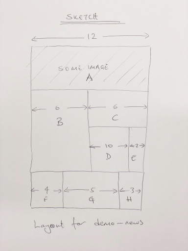
Just focus on widths and ignore heights.
Note that a responsive design page width is 12 units.
Implement your layout
Open Chrome and navigate to http://localhost/dbnetrd
Open your Responsive Design Form Designer.
Makes sure that your work folder is set to "demo".
You'll see a rectangle on on your page. That rectangle is a Column inside a Row.
First, a quick note on our grid structure
On a DesignBais (RD) page, the grid hierarchy is as follows:
A page can have multiple rows, a row can have up to 12 columns, a column can have multiple Elements (html text, input boxes, buttons etc) in it.
An Element can be as simple as a button or more complex structure consisting of an input text box and its associated components; label, help text, error block, tool tip etc.
Click to highlight the rectangle (i.e. your first default column). This is the column where your "A" will go.
Press CTRL+D to create a new row.
Press CTRL+J to add a column to your new row. Now you have two columns each having a width of six units. These are your blocks "B" and "C".
Click block C and and press CTRL+O. This will add a new row with two columns inside C. The new row has two columns. Click one of them and press DEL to delete that column.
Click C then press CTRL+D to add a new row under C.
Click CTRL+J to divide the new row into two creating D and E.
Click B and press CTRL+D to create new row with one column (a full width F).
CTRL+J to add column G
CTRL+J again to add column H
These last two column additions will make F, G and H 1/3 of the page width (i.e. 4 units each)
Adjust column widths
Right click D and select Row > Adjust Columns.
Under "-md", you'll see the width of each column (D and E) in that Row. They are both six by default. Change the first to 10 and the second to 2 to make the widths of D and E as marked in our sketch and OK to close.
Note: The meaning of -xs, -sm, -md and -lg are explained in our manuals. Basically, they signify how the widths of these columns will appear in various screen sizes; extra small (-xs), small (-sm), medium (-md) and large (-lg). In most cases you can just set the values for "-md" and leave others blank. Using the "Adjust Columns" menu, you can specify different proportions for the columns of a row for different screen sizes. Note that the total of width units for a given screen size should equal 12. e.g. for two columns you can have (1+11, 2+10, 3+9, ...11+1).
Similarly set the -md widths of F, G and H as 4, 5 and 3 respectively.
Create HTML text (an Element)
Click each column A to H and pres CTRL+K to insert HTML text (Lorem ipsum) in each column.
Click HTML Text (Lorem ipsum) in each column, press CTRL+Q to edit and change each text to its corresponding column letter; A to H.
Save, Publish and Form Data Links
Press ALT-S to save your page as "news" and ALT-L to publish.
Navigate to http://localhost/dbnetrd?ac=dev, open your Responsive Design Form Data Links, locate the page "demo-news" and submit to save the data links.
Test Point
In a new Chrome browser TAB navigate to http://localhost/dbnetrd?dbpage=demo-news
Resize the browser window to see how your layout changes in various screen sizes.